
Content Experience & CMS Optimization
Details
UX Research, Content Strategy & Funnel Optimization for DocMorris Advisory Pages
Categories
UX Research
Content
Date
Client
DocMorris
Project Overview & Responsibilities
Project Overview
DocMorris commissioned a UX optimization initiative focused on its Diabetes Ratgeber pages to better support users seeking educational health content and related services.
The goal was to improve discoverability, comprehension, and engagement while increasing interaction with relevant downstream services such as e-prescriptions and diabetes accessory ordering.
The project also needed to balance user needs, SEO requirements, business goals, and healthcare-related legal constraints.
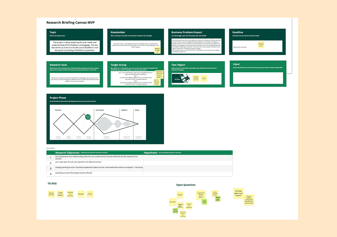
My role was to lead the end-to-end research and concept process—from stakeholder alignment and research planning to testing, synthesis, and optimization recommendations.
My Role & Responsibilities
Conducted stakeholder alignment workshops to define:
business goals
research goals
hypotheses
success criteria
Identified key business challenges and funnel opportunities
Developed the complete UX research plan and testing structure
Created a clickable prototype in Figma based on existing CMS components
Designed and moderated qualitative user interviews and usability tests
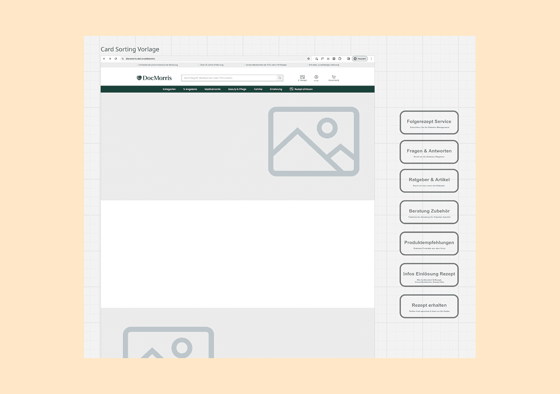
Created and facilitated a card sorting exercise in Miro
Coordinated recruitment and scheduling of participants through DocMorris newsletters
Conducted 6 in-depth remote interviews and usability sessions
Synthesized findings and translated insights into UX and content recommendations
Collaborated closely with:
SEO stakeholders (keywords, headings, content structure, slugs)
Legal teams (healthcare compliance & advertising restrictions)
Business stakeholders and editorial teams
Evaluated readability, comprehension, discoverability, and service visibility
Optimized content structures, navigation entry points, and service communication

Challenges & Approach
Challenge | Approach & Solution |
|---|---|
Low discoverability of Ratgeber topics and services |
|
Need to balance UX, SEO, and healthcare regulations |
|
Users struggled to understand services and content relationships |
|
Older target group unfamiliar with testing tools |
|
Need to understand real user behavior without guidance bias |
|
Overloaded and inconsistent page structures |
|

Tools & Methods
Area | Tools/Method |
|---|---|
UX Research | Qualitative Interviews, Remote Usability Testing, Behavioral Observation, Research Planning |
Testing & Validation | Usability Testing, Content Recall Questions, Navigation Testing, Comprehension Evaluation |
Information Architecture | Card Sorting (Miro), Content Structuring, Topic Discoverability Testing |
UX & UI Design | Figma, Clickable Prototypes, Responsive CMS Components |
SEO & Content Strategy | Keyword Alignment, Heading Structures, Slug Optimization, Educational Content Design |
Cross-functional Collaboration | Stakeholder Workshops, Alignment with SEO, Business & Legal Teams |
Communication & Moderation | Microsoft Teams Interviews, Research Facilitation, Participant Coordination |
Accessibility & Audience Focus | Readability Optimization, Simplified Testing Approaches for Older Users (60–80) |

Outcome & Impact
The research revealed that users had difficulties discovering relevant Diabetes content and understanding how advisory pages connected to related DocMorris services.
Testing also showed that certain page components created unnecessary cognitive load, while important services and CTAs lacked visibility and clarity.
The behavioral testing approach provided valuable insights into authentic navigation patterns, frustration points, and content comprehension—particularly within an older target group.
Outcome & Implemented Solutions
Redesigned navigation and optimized entry points into Diabetes-related content
Improved visibility of downstream services such as:
e-prescriptions
diabetes accessory ordering
Increased click interaction with related healthcare services
Simplified page structures and removed unnecessary components
Improved readability, clarity, and content comprehension
Optimized service communication and educational storytelling
Refined page hierarchy while balancing:
user expectations
SEO relevance
business priorities
Business Impact
Increased engagement with healthcare-related services and funnels
Improved discoverability of educational content and related offerings
Better alignment between UX, SEO, business, and legal requirements
Stronger content clarity for older target groups
Established research-driven foundations for future Ratgeber optimizations

Content Experience & CMS Optimization
Details
UX Research, Content Strategy & Funnel Optimization for DocMorris Advisory Pages
Categories
UX Research
Content
Date
Client
DocMorris
Project Overview & Responsibilities
Project Overview
DocMorris commissioned a UX optimization initiative focused on its Diabetes Ratgeber pages to better support users seeking educational health content and related services.
The goal was to improve discoverability, comprehension, and engagement while increasing interaction with relevant downstream services such as e-prescriptions and diabetes accessory ordering.
The project also needed to balance user needs, SEO requirements, business goals, and healthcare-related legal constraints.
My role was to lead the end-to-end research and concept process—from stakeholder alignment and research planning to testing, synthesis, and optimization recommendations.
My Role & Responsibilities
Conducted stakeholder alignment workshops to define:
business goals
research goals
hypotheses
success criteria
Identified key business challenges and funnel opportunities
Developed the complete UX research plan and testing structure
Created a clickable prototype in Figma based on existing CMS components
Designed and moderated qualitative user interviews and usability tests
Created and facilitated a card sorting exercise in Miro
Coordinated recruitment and scheduling of participants through DocMorris newsletters
Conducted 6 in-depth remote interviews and usability sessions
Synthesized findings and translated insights into UX and content recommendations
Collaborated closely with:
SEO stakeholders (keywords, headings, content structure, slugs)
Legal teams (healthcare compliance & advertising restrictions)
Business stakeholders and editorial teams
Evaluated readability, comprehension, discoverability, and service visibility
Optimized content structures, navigation entry points, and service communication
Challenges & Approach
Challenge | Approach & Solution |
|---|---|
Low discoverability of Ratgeber topics and services |
|
Need to balance UX, SEO, and healthcare regulations |
|
Users struggled to understand services and content relationships |
|
Older target group unfamiliar with testing tools |
|
Need to understand real user behavior without guidance bias |
|
Overloaded and inconsistent page structures |
|
Tools & Methods
Area | Tools/Method |
|---|---|
UX Research | Qualitative Interviews, Remote Usability Testing, Behavioral Observation, Research Planning |
Testing & Validation | Usability Testing, Content Recall Questions, Navigation Testing, Comprehension Evaluation |
Information Architecture | Card Sorting (Miro), Content Structuring, Topic Discoverability Testing |
UX & UI Design | Figma, Clickable Prototypes, Responsive CMS Components |
SEO & Content Strategy | Keyword Alignment, Heading Structures, Slug Optimization, Educational Content Design |
Cross-functional Collaboration | Stakeholder Workshops, Alignment with SEO, Business & Legal Teams |
Communication & Moderation | Microsoft Teams Interviews, Research Facilitation, Participant Coordination |
Accessibility & Audience Focus | Readability Optimization, Simplified Testing Approaches for Older Users (60–80) |
Outcome & Impact
The research revealed that users had difficulties discovering relevant Diabetes content and understanding how advisory pages connected to related DocMorris services.
Testing also showed that certain page components created unnecessary cognitive load, while important services and CTAs lacked visibility and clarity.
The behavioral testing approach provided valuable insights into authentic navigation patterns, frustration points, and content comprehension—particularly within an older target group.
Outcome & Implemented Solutions
Redesigned navigation and optimized entry points into Diabetes-related content
Improved visibility of downstream services such as:
e-prescriptions
diabetes accessory ordering
Increased click interaction with related healthcare services
Simplified page structures and removed unnecessary components
Improved readability, clarity, and content comprehension
Optimized service communication and educational storytelling
Refined page hierarchy while balancing:
user expectations
SEO relevance
business priorities
Business Impact
Increased engagement with healthcare-related services and funnels
Improved discoverability of educational content and related offerings
Better alignment between UX, SEO, business, and legal requirements
Stronger content clarity for older target groups
Established research-driven foundations for future Ratgeber optimizations


